Seven Common Mistakes When Replacing Slipped or Broken Slates
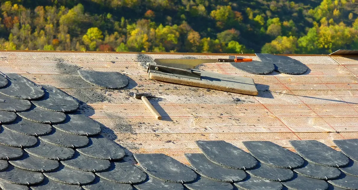
A slipped slate looks like a ten-minute job, but wrong nails, mismatched sizes and torn underlay turn a...

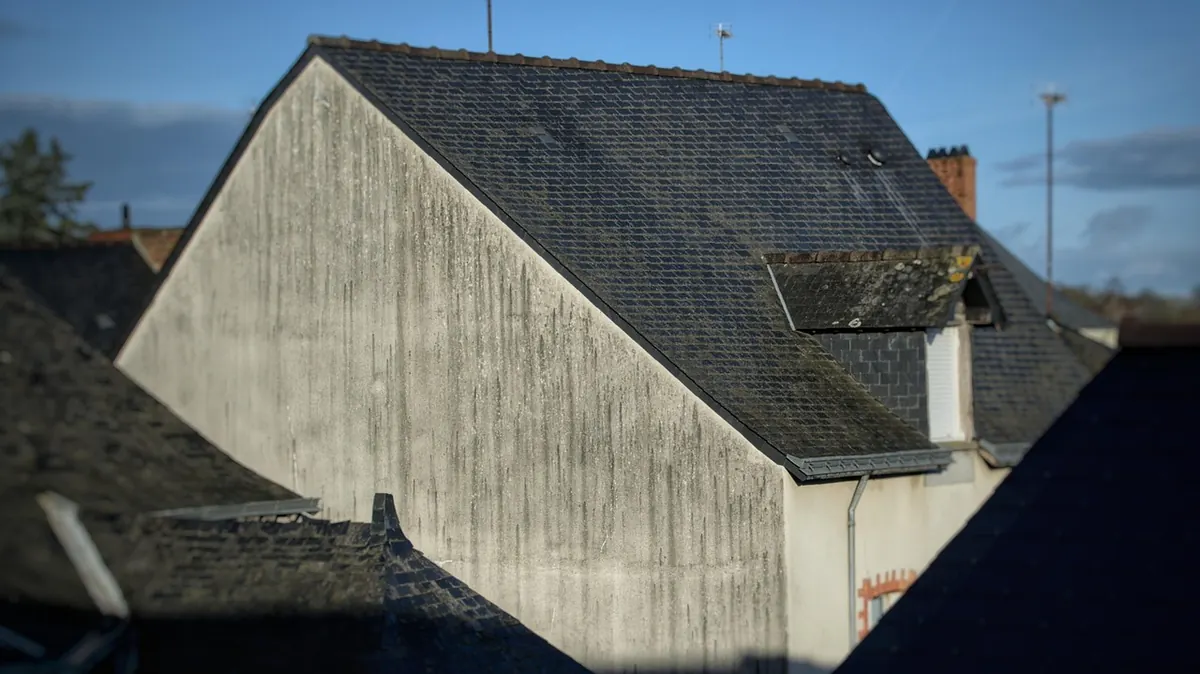
A slate roof is the largest single element of most period houses. You see it from the lane before you see the front door, and it sits above every photograph of the place. Yet it is often the last thing anyone thinks about properly. People will spend three weekends choosing a paint colour for a hallway nobody sees, then order forty tonnes of slate on the strength of a thumbnail on a merchant's website. Colour, size and texture read completely differently at thirty metres, and they weather differently too. Start with the house and the street, not the sample board.
Before you look at a single slate, work out roughly what came off the roof. Georgian and early Victorian houses were usually laid in diminishing courses: the largest slates at the eaves, the smallest at the ridge, so the roof seems to taper gently as it rises. Later Victorian and Edwardian roofs tend to be more uniform, sometimes with decorative bands, diamonds or scalloped courses.
Regional patterns matter too. Welsh blue-grey travelled widely by rail and canal and became the default across much of Britain. Westmorland green largely stayed in Cumbria and the north. Scottish roofs used smaller, darker slates, often in graded courses. If two or three roofs of the same age on your street still look original, or you can see the back of a slate behind a dormer or under a flashing, you have your best guide.
If the house is listed or sits in a conservation area, changing the covering normally needs consent, and the local authority will expect a close match in material and appearance. Speak to the conservation officer early, before you fall in love with a particular slate.
The traditional blue-grey is the safest choice and the easiest to live with. It sits calmly on stone, pale brick, render and flint alike, and it ages well, softening to a silvery tone with a little lichen along the laps. Welsh grey is the benchmark; Spanish and Canadian grey are widely available alternatives with a slightly harder, flatter look.
Dark, sharp and formal. This was the Victorian commercial default and it looks superb on red brick and on crisp white render, where the contrast is deliberate. On a soft, mellow stone cottage it can feel a little severe, and any patchiness in thickness shows up more clearly in dark slates because the surface reflects light so strongly.
Westmorland green runs from soft sage to olive and buff, with a faint sheen that changes through the day. It is the natural choice in the Lake District, the Pennines and much of the north, and it flatters limestone and gritstone beautifully. Against orange or strongly red brick it can look uneasy, and green slate is generally heavier and more expensive than grey, so check the roof structure before committing.
Heather slate carries a mottled mix of purple, brown, green and grey, most famously from the Welsh quarries around Bethesda. It lifts a plain roof into something with real depth, and it suits stone, render and weathered brick. It is also a strong, busy colour: on a facade with a lot of detail already, or with bright red brick, it can start to argue with itself. Many suppliers sell heather as a blend rather than a single shade, which is usually the more forgiving option.
Whatever you choose, remember that slate is not a fixed colour. Newly quarried slate looks darker and glossier when wet; across a season it settles into a softer, more mottled tone. Ask to see samples both wet and dry, and view them on the roof line, not on a bench.
Large slates give a calm, unbroken roof with fewer visible lines. Small slates give a finer grain and a busier surface, which suits small cottages, steep pitches and older buildings. Size is also a structural question, not just an aesthetic one.
Keep to one quarry and one thickness for the whole roof. Mixing sources to save a little money is the fastest way to a roof that looks patched from the ground.
A riven, natural-cleft face is split rather than dressed. It carries faint ripples and ridges that catch low sunlight, and it hides the small irregularities of an old, slightly uneven roof. It is the softer, older-looking option and usually the right one for a period property.
Sanded or dressed slate is flat and even, with a crisper reflectivity. It suits a plain Georgian facade or a sharp later-Victorian villa, and being smoother it tends to shed water and debris a little more readily. Heavily rustic, rough-textured slate is best kept for cottages and outbuildings, where the extra shadow and movement is welcome rather than overwhelming.
Ridges, hips, valleys, verges and dormers interrupt the colour and give the eye somewhere to rest. Reclaimed or new decorative courses, a contrasting ridge or a run of small slates around a dormer will do more for the finished look than a shade of grey. So will the gutters, fascias and rainwater goods: dark cast iron against a blue-black roof is a very different building from white plastic beneath the same slate.
Finally, look at the roof as part of a terrace or a street. A single house with an unusual slate, hemmed in by identical neighbours, will always stand out. Sometimes that is exactly what you want. Often it is not.
Then leave it alone. A well-chosen period roof should look unremarkable for fifty years: not a feature anyone comments on, just the right covering for a house that has already outlasted several of them.
Photo: richardfoulon / Pixabay
A slipped slate looks like a ten-minute job, but wrong nails, mismatched sizes and torn underlay turn a...
A month-by-month routine for inspecting a slate roof from the ground, spotting slipped slates and blocked...
Twelve seasonal jobs — from clearing gutters and checking flashings to replacing slipped slates and...